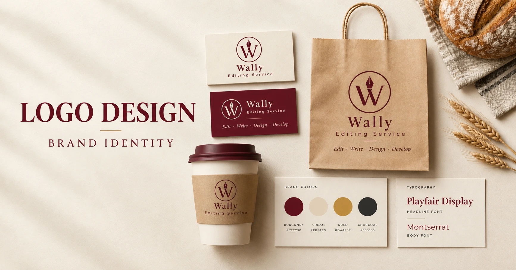
Ask people what they remember about a brand they like and the logo is rarely the first thing they mention. It’s the orange on the packaging, the font on the shop sign, the way the Instagram feed looks like one piece. The logo matters, but it’s only part of a bigger look. Logo design and brand identity are two different jobs that have to work together, and this guide covers how, plus how to pick a logo style and what to get ready before you talk to a designer.
What Is Logo Design and Brand Identity?
Logo design is making the mark itself: a name in a certain typeface, a symbol, a set of initials, or some mix of those. Brand identity is everything around that mark. Colors, fonts, photo style, how layouts are spaced, the look of anything you print or post.
Picture a small bakery. The logo goes on the boxes. The same cream and burgundy turn up on the website, the paper bags, the menu board and the Instagram highlights. Nothing there is identical, yet you’d never mistake it for a different shop. That’s the point. It’s also why professional logo design works better when it’s planned as part of the whole look and not handed over as a single file.
Why a Professional Logo Matters for Your Business
A logo won’t make people buy, and nobody trusts a company just because the artwork is nice. What it does is smaller and more useful.
1. People can spot you faster
Someone sees your flyer on Monday and your website on Thursday. If the mark and colors match, they connect the two without thinking. If every platform has a slightly different version, they don’t. Simple as that.
2. It sets the tone before anyone reads a word
A law firm and a kids’ trampoline park shouldn’t look alike, and nobody needs a study to know that. But the smaller choices matter too: sharp corners or round, thin lines or heavy ones, tight spacing or loose. Each one nudges how serious, friendly or expensive you seem. A good designer decides on those on purpose. A rushed one just picks what looks nice.
3. It keeps you from looking sloppy
We’ve all landed on a business page with a stretched, blurry logo and a mismatched banner and quietly assumed the place is a bit chaotic. Maybe it isn’t. But that’s the guess people make. A consistent identity also saves you effort later, since new materials start from something that already works.
4. It gives your marketing somewhere to start
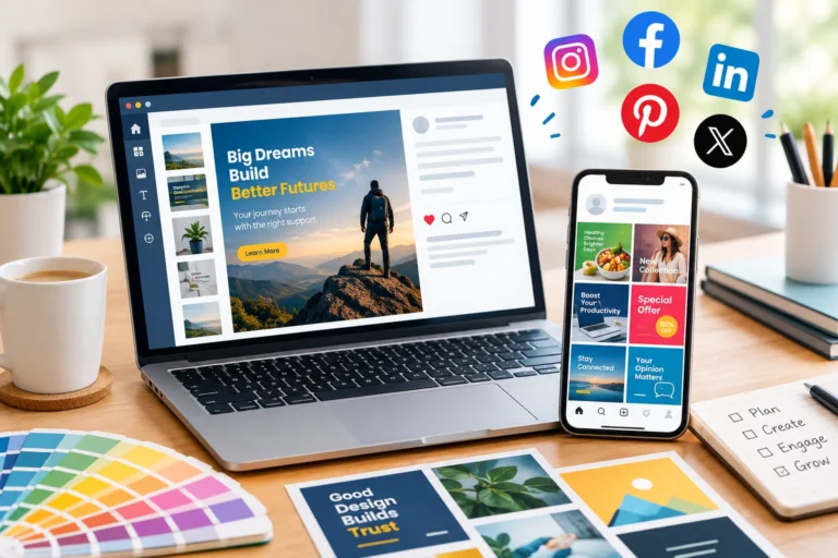
Once the logo and a few basic rules exist, the rest gets faster. Ads, slide decks, brochures and social media design for businesses all pull from the same colors and fonts, so you aren’t reinventing the look every time you launch something.
The Key Elements of a Strong Brand Identity
You don’t need a thick brand book. A few decisions, made once and used everywhere, cover most of it.
Logo and logo variations
Test the logo small before you fall in love with it. A detailed mark can look great on a monitor and turn into a smudge as a social profile picture or a 32-pixel browser icon. Most businesses end up with a main logo, a simplified icon, a horizontal version, and versions for light and dark backgrounds. They should look like siblings.
Sizing is a common trip-up too. A standard US business card is 3.5 by 2 inches, which at 300 DPI is 1,050 by 600 pixels. An inches to pixels converter does that math for any size you throw at it.
Color palette
Pick one main color and let it do most of the work. Add a couple of supporting ones for backgrounds, headings and buttons. Then check the contrast, because pale gray text on white looks elegant right up until someone has to read it. Colors also shift between screens (RGB) and print (CMYK), so ask for both versions.
Typography
Two fonts is plenty, one for headings and one for body text. Choose for readability first. If your materials include another language, check the font supports it, and test it in print as well as on the web.
Supporting visuals
Photos, icons and patterns should back the logo up, not fight it. If your logo is clean and quiet, a busy collage in the brochure will feel like it came from somewhere else.
How to Choose the Right Logo Style
Knowing the five common formats makes it easier to tell a designer what you’re after.
- Wordmark: just the name, styled. Works well when the name is distinctive and easy to read.
- Lettermark: initials. Good for long names, if the letters are memorable.
- Symbol or icon: a graphic mark. Pays off once people already know who you are.
- Combination mark: name plus symbol, and you can often split them up when you need to.
- Emblem: the name inside a badge or seal. Suits groups that want a traditional, established feel.
There’s no winner here. Your name, industry and audience decide it. So does where the logo will live. A mostly online business cares about website headers and profile pictures. If you sell physical products, you’ll also need packaging, labels and print-ready files.
When Should You Redesign Your Logo?
Most businesses don’t need a new logo. If yours is clear and you use it consistently, leave it alone. It might be time for a change if:
- It looks dated next to your competitors.
- Fine details or small text vanish at small sizes.
- It prints badly, or looks different on every screen.
- Your services, audience or name have changed.
- Three people are using three different versions.
- You can’t find the original files anywhere.
A redesign doesn’t have to start from zero. Sometimes it’s just tidier spacing, a simpler symbol, or a proper set of variations. If that sounds like you, a logo edit and redesign service can refresh what you’ve got and keep the recognition you’ve already earned.
What to Prepare Before Hiring a Logo Designer
A clear brief saves everyone time and gets you better feedback. Pull together:
- What you do: and what makes you different from the next business.
- Who it’s for: the customers you want and the impression you want to leave.
- Your personality: three or four words, like modern, friendly, premium, practical.
- Styles you like: examples, plus a line on what you like about each.
- Competitors: so the designer can steer clear of looking like them.
- Where it’ll be used: website, social, packaging, documents, printed ads.
- File formats: ask for a vector version (SVG or PDF) for print and resizing, plus transparent PNGs for screens.
Settle the scope, number of revisions, timeline and who owns the final files before anyone starts sketching. It’s a boring conversation that prevents awkward ones later.
How Logo Design Connects with Your Other Marketing Materials
Your website, social posts, business cards and brochures should feel related without being copies. Business card design is usually the first place a new logo shows up in real life, since it goes into people’s hands at meetings and events. The same colors and type then carry into your social graphics. Bigger campaigns might need flyers, banners or posters, and Wally’s graphic design services cover those too.
A social post shouldn’t look like a business card. It should just look like it came from the same business.
Build a Stronger Brand with Wally Editing Service
Good branding starts with knowing what you want your business to say. A logo that fits, colors you use consistently, readable fonts and matching graphics all help that message come through wherever customers find you.
At Wally Editing Service, we handle logo design, redesign and the materials that go with them. Starting fresh or fixing something old, begin with your goals, your style and where the design will be used. You think the concept, we lead you to completion. When you’re ready, place your order and tell us what you need.
Frequently Asked Questions
What’s the difference between a logo and a brand identity?
A logo is one mark. Brand identity is the whole system around it: colors, fonts, imagery and layouts that keep everything looking related.
Which logo file formats should I ask for?
A vector file (SVG or PDF) for printing and resizing, and PNGs with transparent backgrounds for websites and social media.
Do I need a full redesign or just a refresh?
If the logo still fits but looks tired or breaks at small sizes, a refresh is usually enough. If your services, audience or name have changed, a full redesign makes more sense.
Should my logo look identical everywhere?
The core mark should. Sizes and layouts can change, like a simple icon for profile pictures and a horizontal version for page headers, as long as they clearly belong together.
Usman Javed is a content strategist at Wally Editing Service, where he leads the content and SEO division. He writes about website copy, SEO strategy, and content that actually works for the businesses reading it.