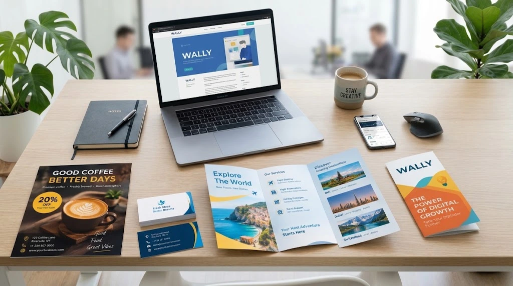
Most customers won’t read everything you print, so a flyer or brochure has to do its work quickly. It needs to tell people what you offer, why it’s worth their time, and what to do next. Design is what makes that happen. A good layout doesn’t just look nice. It decides what gets noticed first.
Digital marketing keeps growing, but print still earns its place for local shops, events, restaurants, schools, product launches and professional services. A well-made flyer design can grab someone’s attention in a couple of seconds, and a brochure gives you room to explain more. What matters is pairing a clean look with clear information and one specific goal.
Why Flyers and Brochures Still Matter
You can hand them out at events, slip them into packages, leave them at the counter or pin them to a noticeboard. They go wherever your customers already are.
A social media post disappears down the feed by tomorrow. A brochure can sit on someone’s desk for a week, and a flyer might get taken home and looked at again before anyone decides to call. That staying power is hard to get from a post.
But printing information on a page isn’t enough. If the layout is cluttered, the message is vague or there’s far too much text, even a really good offer gets ignored. The design has to lead the reader’s eye and make the next step obvious.
1. Flyer Design: Say It Fast
A flyer usually promotes one thing, whether that’s an offer, an event, a product or a service. People glance at flyers for a few seconds, so the message has to be direct.
Start with the goal. A restaurant might be pushing a seasonal menu, a training centre might be opening admissions, and a retailer might be running a weekend discount. Whatever it is, build the flyer around that one idea and leave the rest out.
Most effective flyers include:
- A headline that explains the offer at a glance
- Visuals that support the message instead of competing with it
- A few useful lines about the product, service or event
- A phone number, website or QR code
- A clear call to action like “Book Now,” “Visit Us” or “Register Today”
Hierarchy matters here. The headline should be the first thing people see, then the main benefit, then the details. And don’t make anyone hunt for your contact information.
Size and format count too. A flyer handed out on the street doesn’t need the same layout as one pinned to a wall. Before you print, check the dimensions, image quality, margins and bleed so nothing gets cropped. If you already have a flyer that just needs fixing, flyer editing is often quicker than starting over.
2. Brochure Design: Room to Explain
Where a flyer sticks to one message, a brochure can tell a fuller story. It can introduce your company, walk through several services, compare options or explain how your process works.
Good brochure design breaks all that into sections so readers don’t feel buried. A digital agency, for example, could cover who they are, what they do, how they work and how to get in touch, each in its own part. Short paragraphs, clear headings, relevant images and plenty of white space make it easier to follow. Keeping your colours and fonts consistent also makes the whole thing feel more professional.
Before you start, decide what the brochure really needs to say. It’s tempting to include every detail about the business, but that usually makes the page feel crowded. Stick to what a customer needs to make a decision.
The format should fit the job. A bi-fold works well for a short company introduction, a tri-fold lets you give each service its own panel, and a multi-page brochure suits a bigger range of offerings.
Above all, don’t just list features. Explain how your business helps and why it matters to the person reading.
3. Keep Everything Consistent With Your Brand
A flyer and a brochure do different jobs, but they should still look like they came from the same business. Colours, fonts, logo placement, imagery and tone of writing all help people recognise you.
Too many typefaces or random colours make materials look disorganised. A consistent visual system looks more professional, and it makes your next project easier to produce.
If your brand guidelines already exist, professional graphic design services can help you carry them across every piece. The aim isn’t to make everything identical, only to keep a few recognisable elements while adapting each layout to its purpose. If you’re still working on the basics, a clean logo design is usually the best place to begin.
4. Let Supporting Designs Do Some Work
Flyers and brochures usually perform better when they’re part of a bigger plan. Say you’re promoting an event. You could hand out flyers, leave brochures at the venue and post matching graphics online.
That last part is where social media post and ad creative design comes in. When the visuals match, people recognise your campaign wherever they see it, and you can still adapt each design to suit its platform.
Other materials can back up the same message. A well-made business card design lets people keep your details after meeting you. Schools, training providers and event organisers can also benefit from careful certificate editing so every document looks polished.
Each piece has a role. The flyer catches attention, the brochure explains, social graphics widen the reach and the business card makes follow-up easy. Together, they tell one consistent story.
5. Common Mistakes to Avoid
Too much text is the biggest one. Promotional materials should carry the essentials, not every detail about your business.
Low-quality images and mismatched fonts are close behind. Blurry visuals and crowded layouts weaken the impression you’re trying to make, and a headline that doesn’t explain the offer can lose people before they read further.
Don’t bury your contact details or settle for a weak call to action either. Readers need a clear next step, whether that’s visiting a website, booking, asking for a quote or turning up to an event.
And always proofread before printing. Check spelling, dates, prices, phone numbers, web addresses, image resolution and print specs. A final read-through costs nothing, while reprinting does.
Make Your Print Materials Work Harder
Flyers and brochures are still a solid way to share offers, present services and reach new customers. What makes them work isn’t flashy colour or decoration. It’s a clear message, tidy information, consistent branding, readable type and a useful call to action.
Before you start, decide who you’re talking to, what you want them to do and which format suits that goal. Then look at the finished design the way a customer would. Is the message clear? Are the benefits easy to find? Is the next step obvious?
At Wally Editing Service, careful design and attention to detail help businesses present their ideas properly. If you need a flyer for a special offer or a brochure that explains your services, contact Wally Editing Service to talk through what you need.
Usman Javed is a content strategist at Wally Editing Service, where he leads the content and SEO division. He writes about website copy, SEO strategy, and content that actually works for the businesses reading it.